No matter how well designed a website is, errors can occur, leading to a 404 page. But what if I told you that a custom 404 page could actually enhance the user experience? It’s true! By creating a personalized error message, you can add a touch of creativity and lightheartedness to an otherwise frustrating situation. Not only does a custom 404 page provide a better user experience, but it also presents an opportunity for branding and maintaining consistent design elements.
Key Takeaways:
- Errors can happen on any website, resulting in a 404 page.
- A custom 404 page with a personalized error message enhances the user experience.
- Custom 404 pages provide an opportunity for branding and consistent design elements.
What Does a 404 Page Look Like?
When encountering a 404 page, users expect to see an error message indicating that the requested page cannot be found. However, to ensure a positive user experience, it’s important to go beyond a generic error message. A well-designed 404 page should incorporate elements that reassure users that they are still on the correct website.
One of the best practices for a 404 page is to include consistent design features that reflect the branding elements and fonts used throughout the website. This helps users recognize that they haven’t landed on a different website or encountered a fake error page.
Another useful addition to a 404 page is providing alternate website links. These links can redirect users to other relevant pages on the website or showcase popular content that they might be interested in exploring. It helps to guide users back on track and prevents them from leaving the site entirely.
To illustrate the importance of consistent design and branding elements, take a look at the example below:
| Error Page Design Ideas | Error Page Best Practices |
|---|---|
| 1. Use engaging visuals and illustrations to make the error page visually appealing. | 1. Incorporate clear and concise error messages to inform users about the issue. |
| 2. Introduce humor to make the error experience more enjoyable. | 2. Include a search bar to help users find the content they were looking for. |
| 3. Add navigation links or a sitemap to assist users in finding their desired content from the error page. | 3. Include a list of relevant resources or popular content to keep users engaged on the website. |
By following these 404 page best practices, you can create an error page that not only communicates the issue effectively but also maintains a consistent and visually appealing design. Remember, a user-friendly 404 page can contribute to a positive user experience and ultimately increase user engagement on your website.
What Should I Put on a Custom 404 Page?
When creating a custom 404 page, it’s essential to consider the elements that will engage and entertain users while providing a seamless error experience. A well-designed custom 404 page not only adds a touch of humor to make the error more bearable but also serves as an opportunity to showcase useful and informative content. Here are some ideas on what you can include:
- Humorous message: Infuse a bit of humor into your custom 404 page. A witty and lighthearted error message will help lighten the mood and put a smile on your users’ faces.
- Marketing materials: Feature marketing materials on your custom 404 page to keep users engaged and informed about your products or services. Highlight upcoming releases, special offers, or anything else you want to highlight.
- Links to popular content: Provide links to popular content within your website to encourage users to explore more. This can help retain their interest and reduce the chances of them leaving your website entirely.
- Search bar: Include a search bar on your 404 page to empower users to find what they were originally looking for. This helps redirect them to relevant content and keeps them engaged on your site.
To ensure a clean and user-friendly design, opt for a minimalistic layout with minimal clutter. By following these practices, you can create a custom 404 page that not only addresses the error but also provides a positive user experience.
Example of a Custom 404 Page:
Oops! Looks like you took a wrong turn.
But don’t worry, we’re here to guide you back on track!While we fix the issue, why not check out our latest products?
You might just find something you love!Here are some popular links to get you started:
- Home
- Products
- Blog
If you’re still lost, feel free to use our handy search bar below to find what you’re looking for:
How Do I Create a 404 Page?
Creating a custom 404 page is crucial for improving user experience on your website. By personalizing the error message and incorporating design elements that reflect your brand, you can effectively engage your target audience and optimize the user experience. Here are the steps to create an effective 404 page:
1. Determine Design Elements
Before crafting your custom 404 page, consider the design elements that align with your brand’s aesthetics. Choose color schemes, fonts, and graphics that convey your brand’s personality and reinforce its visual identity.
2. Configure the Server
To ensure your custom 404 page is displayed when needed, configure your server to show the “error 404” message. This ensures that visitors are directed to the appropriate error page whenever they encounter a broken link or non-existent page on your site.
3. Track Site Metrics
Monitoring site metrics is essential for gaining insights into user behavior and optimizing the overall user experience. By analyzing data such as bounce rates and page views, you can identify recurring 404 errors and address them accordingly.
4. Encourage Exploration
One of the key benefits of a custom 404 page is the opportunity to encourage users to explore additional content on your website. Include relevant links to popular pages, blog posts, or product categories to entice visitors to further engage with your site.
5. Improve Search Traffic
A well-designed and user-friendly 404 page can indirectly help with SEO by improving search traffic. When users encounter a broken link and are redirected to your custom 404 page, they may be inclined to stay on your site and continue their search. This can potentially increase your website’s visibility and attract organic traffic.
| Benefits of a Custom 404 Page |
|---|
| Enhances user experience |
| Strengthens brand identity |
| Encourages user exploration |
| Improves search traffic |
By following these steps and considering the benefits of a custom 404 page, you can create a more engaging and error-resistant website experience for your visitors. Remember to regularly review your site metrics to ensure that your custom 404 page is effectively improving the user experience and driving better search traffic.

Does a Custom 404 Page Help SEO?
While a custom 404 page may not directly improve SEO rankings, it can have a significant impact on the overall user experience. When compared to generic error messages, a custom 404 page enhances user perception and increases the likelihood of users exploring other content on your website. By optimizing the 404 page with relevant links and engaging content, it indirectly contributes to SEO efforts.
What Error Pages Should a Website Have?
In addition to 404 error pages, a website should have various other types of error pages to ensure a smooth user experience. These error pages serve different purposes and require specific attention to effectively handle the encountered errors. By addressing these errors promptly, you can enhance user satisfaction and maintain their engagement with your website.
401 Error: Insufficient Authentication Credentials
A 401 error signifies that the user lacks the necessary authentication credentials to access a particular resource on the website. This error commonly occurs when a user attempts to access protected content without proper authorization. By providing a clear error message and guiding users towards appropriate login or registration options, you can ensure that they understand the requirements for accessing the desired content.
403 Error: Lack of Permissions
A 403 error occurs when the user is denied access to a specific resource due to insufficient permissions. This error is commonly encountered when trying to access restricted areas or perform restricted actions on the website. To handle this error effectively, provide an error message that explains the reason for the denial and offer helpful suggestions or links to alternative content or areas that are accessible to the user.
500 Error: Server Issues
A 500 error indicates an internal server issue that prevents the proper functioning of the website. This error is not user-specific and typically occurs due to server misconfigurations or other technical difficulties. When encountering a 500 error, it is vital to display a polite error message and apologize for the inconvenience caused. Additionally, consider providing alternative ways for users to access the content they were seeking, such as through a site search or by recommending related content.
Having these different error pages in place helps you maintain a seamless user experience and provides visitors with clear explanations when issues arise. By addressing errors promptly and displaying informative error messages, you can minimize frustration and keep users engaged with your website.
| Error Type | Error Code | Error Message |
|---|---|---|
| 401 Error | 401 Unauthorized | You are not authorized to view this content. Please log in or register to access it. |
| 403 Error | 403 Forbidden | Access to this resource is denied. Please check your permissions or explore other available content. |
| 500 Error | 500 Internal Server Error | We apologize for the inconvenience. Our server is currently experiencing technical difficulties. Please try again later or explore alternative content. |

“By providing informative and user-friendly error pages, you can turn frustrating encounters into positive experiences, leaving visitors with a good impression of your website and brand.”
Best Practices for Customizing a 404 Page
When it comes to customizing your 404 page, there are a few best practices you should keep in mind. These tips will help you create a user-friendly and engaging error page that keeps visitors on your website. Check out the following recommendations:
1. Clear Error Messages
An effective custom 404 page starts with a clear error message that clearly communicates to users that the requested page cannot be found. Use simple and concise language to explain the error, and avoid technical jargon that might confuse visitors. A well-written error message can help alleviate frustration and guide users towards finding a solution.
2. Search Bar for Easy Navigation
Incorporating a search bar on your 404 page allows users to quickly search for the content they were originally looking for. This functionality reduces user frustration and improves overall website navigation. Make sure the search bar is prominently displayed and easy to use.
3. Relevant Resource Listings
Providing a list of relevant resources on your 404 page can help redirect users to alternative content or sections of your website. This keeps them engaged and increases the chances of them finding valuable information. Include links to popular articles, product pages, or frequently asked questions that are likely to interest your visitors.
4. Call-to-Action Buttons
Guide users towards taking specific actions by incorporating call-to-action (CTA) buttons on your custom 404 page. These buttons can encourage visitors to sign up for newsletters, explore featured products, or browse through specific categories. By providing clear next steps, you can keep users engaged and prevent them from leaving your website.
5. Maintain Brand Identity
Your 404 page is an extension of your brand, so it’s essential to maintain consistent design elements and branding. Use your company logo, colors, and fonts to create a cohesive user experience that aligns with the rest of your website. This helps reinforce your brand identity and build trust with visitors.
6. Use the Correct HTTP Status Code
Ensure that your server responds with the correct HTTP status code for a 404 error. This helps search engines understand that the requested page is not available while informing them that it’s a permanent error. Using the appropriate status code assists with SEO efforts and prevents search engines from indexing or caching the error page.
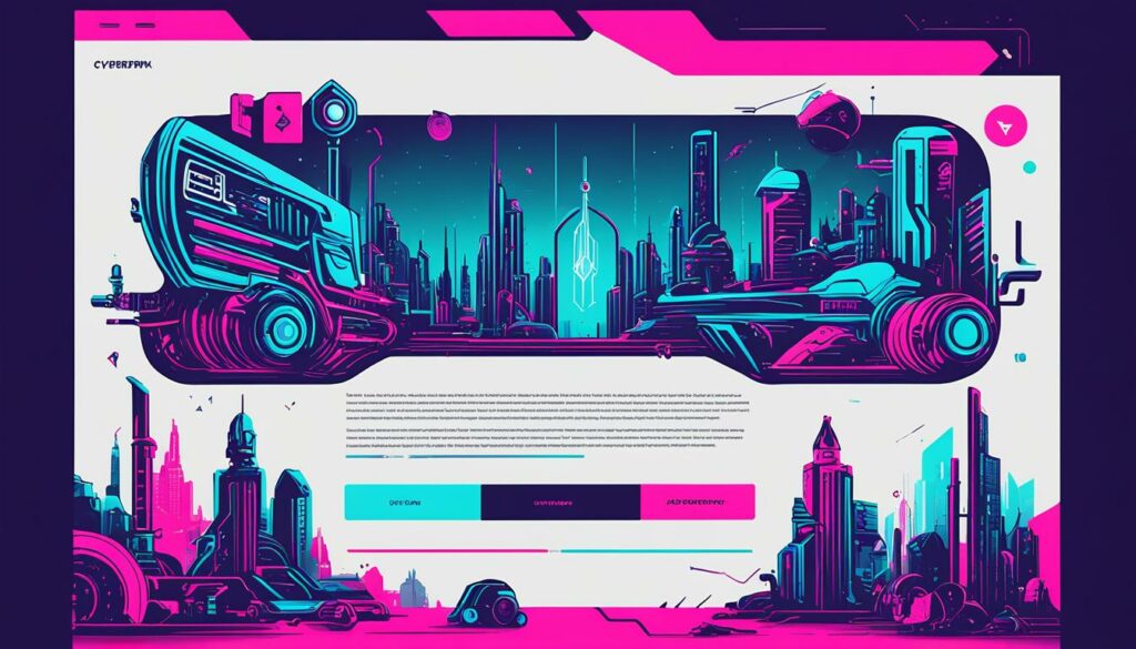
| Best Practices for Customizing a 404 Page |
|---|
| Clear Error Messages |
| Search Bar for Easy Navigation |
| Relevant Resource Listings |
| Call-to-Action Buttons |
| Maintain Brand Identity |
| Use the Correct HTTP Status Code |
Conclusion
Customizing a 404 page is an invaluable opportunity to elevate the user experience and reinforce your brand identity. By adhering to best practices and understanding user needs, you can create a custom 404 page that not only helps visitors navigate your website but also contributes to your SEO efforts.
By implementing engaging and humorous content on your custom 404 page, you can lighten the error experience and leave a positive impression on users. Additionally, including useful resources such as marketing materials and upcoming products can further enhance user engagement and drive conversions.
Remember to maintain a clean and clutter-free design to ensure a seamless user experience. Consistency in branding elements and typography builds trust and reassures users that they are still on your website. By optimizing your 404 page with relevant links and compelling calls-to-action, you can encourage users to explore more content and increase their time on site.
In conclusion, a well-designed and thoughtful custom 404 page can not only help users find their way back but also contribute to your overall website performance. By making the most of this opportunity, you can turn a potential frustration into an engaging and memorable experience that leaves a lasting impression.
FAQ
Q: What is a custom 404 page?
A: A custom 404 page is a personalized error page that appears when a user tries to access a webpage that cannot be found. It is designed to enhance the user experience by providing creative and lighthearted details.
Q: How should a 404 page be designed?
A: A 404 page should have consistent design elements, such as branding elements and fonts, to reassure users that they are still on the correct website. It should also have a clean design with minimal clutter to improve the overall user experience.
Q: What should I include on a custom 404 page?
A: A custom 404 page should include humor to amuse users and make the error experience more bearable. It can also feature useful content, such as marketing materials and upcoming products. Additionally, it should provide clear error messages, search bars, and lists of relevant resources to help users find what they’re looking for.
Q: How do I create a custom 404 page?
A: To create a custom 404 page, decide on the design elements that reflect your brand and cater to your target audience. Configure the server to display the “error 404” message when needed. It is also important to track site metrics to gain insights and optimize the user experience.
Q: Does a custom 404 page help with SEO?
A: While a custom 404 page may not directly improve SEO rankings, it can enhance the overall user experience compared to generic error messages. Custom 404 pages positively impact user perception and increase the likelihood of users exploring other content on the website.
Q: What other error pages should a website have?
A: In addition to 404 error pages, websites can have other types of error pages such as 401 errors indicating insufficient authentication credentials, 403 errors caused by lack of permissions, and 500 errors related to server issues. Each error page serves a different purpose and requires specific attention to provide a smooth user experience.
Q: What are the best practices for customizing a 404 page?
A: Best practices for customizing a 404 page include including clear error messages, search bars to help users find what they’re looking for, and lists of relevant resources. Including call-to-action buttons can guide users to take specific actions, while linking to top content keeps users engaged. It’s important to maintain brand identity and ensure the server responds with the correct 404 HTTP status code.

