Creating an inclusive website that caters to all users is crucial for the success of your WordPress site. In this article, we will explore the importance of website accessibility and how you can ensure that your WordPress site is accessible to everyone.
WordPress Accessibility refers to the design and development practices that make your website usable for individuals with disabilities, as well as those using different devices and search engines. It goes beyond just catering to visually impaired users, extending to mobile users, individuals with temporary difficulties or limited abilities, and those with slow network connections. Ensuring accessibility is not just a moral responsibility but also a legal one.
When it comes to website accessibility, WordPress.com follows industry standards and best practices. They offer a range of mobile-optimized themes that provide a solid foundation for accessibility. They also recommend adding descriptive alt text to images, using headings, readable fonts, and checking color contrast. These steps make your website more screen-reader compatible and improve keyboard navigation.
There are also a variety of accessible WordPress themes available that have undergone testing for compliance with accessibility guidelines such as WCAG 2.1. Additionally, you can test your own themes for accessibility and make necessary improvements.
Key Takeaways:
- Website accessibility in WordPress is essential for providing an inclusive user experience.
- WordPress.com follows web design standards and offers mobile-optimized themes to ensure accessibility.
- Adding descriptive alt text to images and using headings and readable fonts are recommended practices for accessibility.
- Accessible themes tested for compliance are available, and users can test their own themes for accessibility.
- Screen reader compatibility and keyboard navigation are vital for making WordPress sites accessible to all users.
Understanding Web Accessibility
Accessibility is not limited to visual impairments. It encompasses ensuring that websites are usable by all individuals, regardless of their disabilities or the devices they use. Website accessibility is an important aspect of inclusivity that extends beyond accommodating visually impaired individuals.
Web accessibility also benefits mobile users, those with slow network connections, and people with temporary difficulties or limited abilities. It is about making websites inclusive and accessible to as many people as possible, regardless of their circumstances.
By prioritizing web accessibility, you are not only meeting the needs of individuals with disabilities but also promoting a more equal, diverse, and inclusive online environment. It is a civil and human right to have access to information and opportunities on the web.
Improving web accessibility not only enhances user experience but also expands your website’s reach to a wider audience. It ensures that your website is compatible with screen readers and assistive technologies, making it easier for people with disabilities to navigate and access the content. Additionally, it optimizes your website’s performance on mobile devices and improves its visibility on search engines, leading to increased traffic and engagement.
Web accessibility is a vital consideration in today’s digital landscape. Embracing inclusivity and ensuring accessibility will not only benefit your website but also contribute to a more accessible and inclusive online world.
| Accessibility Benefits | Target Audience |
|---|---|
| Enhanced usability for individuals with disabilities | Visually impaired, auditory impaired, motor impaired |
| Improved mobile user experience | Mobile device users, people with limited bandwidth |
| Expanded reach and visibility on search engines | All internet users |
| Inclusive and equal access to information | All internet users |
The Importance of Web Accessibility
Web accessibility is vital for ensuring that all users can access and use a website effectively. When a site lacks accessibility features, a portion of the audience faces barriers in accessing the valuable information it offers. This not only hampers usability but also excludes individuals with disabilities from fully engaging with the content.
Moreover, the absence of web accessibility can have legal consequences for website owners. In recent years, there has been a significant increase in accessibility-related lawsuits. Individuals with disabilities have the right to take legal action against inaccessible websites under disability discrimination laws, such as the Americans with Disabilities Act (ADA) and similar regulations in different countries.
“Lack of accessibility can result in legal consequences, as individuals can take legal action against inaccessible websites.”
These lawsuits highlight the importance of prioritizing web accessibility in order to avoid legal complications and ensure equal access for all users.
To demonstrate the significance of web accessibility, consider the following statistics:
| Statistical Insight | Description |
|---|---|
| 70% | Approximately 70% of websites have accessibility barriers, according to the Web Accessibility Initiative. |
| $6.6 billion | The estimated yearly online spending power of people with disabilities in the United States alone, emphasizing the potential market an accessible website can tap into. |
| 9,000+ | The number of ADA website accessibility lawsuits filed in the United States in 2020, a significant increase compared to previous years. |
By prioritizing website accessibility, you not only create a more inclusive online environment but also mitigate legal risks and reach a broader audience.
To further understand the impact of web accessibility, let’s explore how it enhances usability, improves audience reach, and fosters information availability.
How Accessible is WordPress?
WordPress has made significant strides in improving accessibility with each new release. The WordPress community is passionate about accessibility and continuously works towards making WordPress more inclusive and accessible to all users.
Default WordPress themes have taken steps towards accessibility by implementing best practices and following web standards. These themes prioritize usability for all users, including those with disabilities.
Furthermore, developers in the WordPress community are actively creating assistive tools and resources to enhance accessibility. These tools aim to simplify the process of creating accessible websites and provide solutions for common accessibility challenges.
However, while WordPress has made notable progress, there is still room for improvement. It’s important to consider factors such as theme selection and the use of plugins, as these can impact the overall accessibility of a WordPress website.
Regular accessibility audits can help identify areas for improvement and ensure that the website meets recommended accessibility guidelines, such as the Web Content Accessibility Guidelines (WCAG).
Overall, the WordPress community is committed to accessibility and continues to work towards making WordPress a more inclusive platform for everyone.
Accessibility Improvements in WordPress
Here are some of the notable accessibility improvements in recent versions of WordPress:
- Better keyboard navigation: Keyboard accessibility enhancements allow users to navigate through WordPress using only the keyboard, improving accessibility for individuals who cannot use a mouse.
- Improved Gutenberg editor accessibility: The Gutenberg editor, introduced in WordPress 5.0, has undergone numerous accessibility improvements to make it easier for users with disabilities to create content.
- Enhanced screen reader compatibility: WordPress strives to ensure compatibility with popular screen readers, enabling visually impaired users to access and interact with the content effectively.
These efforts, along with the continuous commitment of the WordPress community, contribute to making WordPress a more accessible platform for users of all abilities.
Community Efforts in WordPress Accessibility
The WordPress community plays a vital role in driving accessibility improvements. Various resources and initiatives have been established to promote accessibility and empower developers to create more accessible websites. Some notable community efforts include:
- WordPress Accessibility Team: The WordPress Accessibility Team focuses on addressing and resolving accessibility issues within the core WordPress software. They actively collaborate with contributors to ensure new features and updates prioritize accessibility.
- Accessibility-focused plugins and themes: Developers within the WordPress community create plugins and themes specifically aimed at improving website accessibility. These resources provide additional functionality and customization options to enhance accessibility.
- Accessibility education and documentation: The WordPress community provides extensive educational materials and documentation on web accessibility. These resources help developers and website owners understand best practices and implement accessibility improvements effectively.
Community-driven efforts continue to shape WordPress as a leading platform for accessible web development.
Making an Accessible WordPress Website
To ensure an accessible WordPress website, it is crucial to incorporate accessibility from the very beginning and continue to prioritize it even after the site is launched. While there is no definitive checklist for achieving 100% accessibility, there are several best practices that can greatly enhance the accessibility of your website.
Integration and Continuous Improvement
Integrating accessibility into the website building process involves considering accessibility at all stages, including design, development, and content creation. By incorporating accessibility principles from the outset, you can create a solid foundation for an inclusive website.
However, accessibility should not be treated as a one-time task. It requires continuous improvement and ongoing efforts to ensure that your website remains accessible to all users. As technology evolves and accessibility guidelines are updated, it is important to stay informed and adapt your website accordingly.
One key resource to guide accessibility efforts is the Web Content Accessibility Guidelines (WCAG). Following these guidelines can help you meet the essential accessibility requirements. WCAG provides a comprehensive framework for making web content more accessible to individuals with disabilities.
Key Accessibility Best Practices
- Adding alt text to images: Alt text provides a textual description of images, making them accessible to individuals who use screen readers or have visual impairments. Ensure that alt text accurately describes the content and purpose of each image.
- Using semantic HTML: Structuring your website with semantic HTML elements (such as headings, paragraphs, and lists) helps screen readers and other assistive technologies understand the content and navigate through the pages effectively.
- Providing clear labels for form inputs: Clearly labeling form inputs helps users understand the purpose of each field and provides context for assistive technologies. Ensure that labels are concise, descriptive, and associated with the corresponding input fields.
- Ensuring color contrast: Proper color contrast between text and background is essential for users with visual impairments. Use WCAG-recommended color contrast ratios to ensure readability and distinguishability of content.
By implementing these best practices, you can significantly improve the accessibility of your WordPress website and make it more inclusive for all users.
Significant progress can be achieved by using various accessibility plugins and themes available for WordPress. These tools provide features and functionality specifically designed to enhance website accessibility. When selecting plugins or themes, prioritize ones that explicitly mention their adherence to accessibility standards and compliance with WCAG guidelines.
Furthermore, the content you create plays a vital role in website accessibility. Ensure that your written content is clear, concise, and easy to understand. Use simple language, break up text into manageable chunks, and provide meaningful headings and subheadings to improve readability and navigation for all users, including those with cognitive disabilities.
Remember, accessibility is an ongoing process rather than a one-time task. Regularly assess and evaluate your website’s accessibility, considering user feedback and emerging accessibility standards. By continuously improving and refining your website’s accessibility features, you can create an inclusive digital experience for all.
BoostedHost offers WordPress Hosting optimized for speed and performance, enabling you to deliver an accessible website to your audience. Sign up now through this link.
| Accessibility Integration: | Continuous Improvement: |
|---|---|
| Integrate accessibility from the beginning | Ensure regular assessments and improvements |
| Consider accessibility in design, development, and content creation | Stay informed about evolving accessibility guidelines |
| Utilize WCAG guidelines for essential accessibility requirements | Adapt your website according to updates in technology and guidelines |
Best Practices for Accessible Design in WordPress
Creating an accessible website is crucial for ensuring a positive user experience for all visitors. In this section, we will discuss some best practices for accessible design in WordPress that can help you improve your website’s accessibility.
Using Descriptive Alt Text for Images
When adding images to your WordPress website, it is important to provide descriptive alt text. Alt text is a short description that is read by screen readers to help visually impaired users understand the content of the image. By using accurate and descriptive alt text, you can ensure that users who cannot see the image still have access to the information it conveys.

Using CSS for Decorative Images
For decorative images that don’t provide any valuable information, it is recommended to use CSS instead of adding alt text. This helps screen readers skip over these images, preventing them from unnecessarily reading out irrelevant descriptions.
Providing Clear Labels for Form Inputs
When creating forms on your WordPress website, make sure to provide clear and descriptive labels for each form input. This helps all users, including those using screen readers, understand the purpose and function of each input field.
Using Semantic HTML Elements
Using semantic HTML elements like headings (h1-h6) and lists (ul, ol) can greatly enhance the accessibility of your WordPress website. These elements provide structure and context to the content, making it easier for screen readers and other assistive technologies to navigate and understand the information.
Ensuring Proper Color Contrast
Color contrast is important for users with visual impairments or those who have difficulty distinguishing between certain colors. Make sure to choose color combinations that meet accessibility standards and provide sufficient contrast between text and background, ensuring that the content is readable by all visitors.
| WCAG Level AA | WCAG Level AAA |
|---|---|
| Minimum contrast ratio of 4.5:1 | Minimum contrast ratio of 7:1 |
By implementing these best practices, you can create a more inclusive and accessible website in WordPress. Remember that accessibility is an ongoing effort, and it’s important to continuously test and improve your website’s accessibility to ensure that all users can fully engage with your content.
We recommend WordPress Hosting from BoostedHost for optimal performance. Sign up now through this link: www.boostedhost.com/wordpress-hosting.
Web Content Accessibility Guidelines (WCAG)
When it comes to ensuring web accessibility, the Web Content Accessibility Guidelines (WCAG) play a crucial role. These guidelines provide standards that aim to make websites usable by all individuals, regardless of their abilities or disabilities. Designers, developers, and other stakeholders involved in the website building process need to be familiar with these guidelines and incorporate them into their work to achieve full accessibility.
WCAG compliance is essential for creating websites that meet accessibility standards. By following these guidelines, you can ensure that your website is inclusive and accessible to a wide range of users. WCAG covers various aspects of web accessibility, including navigation, content, and multimedia. It offers a comprehensive framework that helps designers and developers create websites that are user-friendly and inclusive.
“Web accessibility means that people with disabilities can use the web. More specifically, web accessibility means that people with disabilities can perceive, understand, navigate, and interact with the web, and that they can contribute to the web.” – W3C
WCAG provides clear guidelines for creating accessible web content, including HTML elements, images, multimedia, and color contrast. It focuses on key principles like perceivability, operability, understandability, and robustness to ensure a comprehensive approach to accessibility.
With WCAG compliance, your website can reach a broader audience and provide a better user experience for all visitors. It also helps in mitigating legal risks and demonstrates your commitment to inclusivity.
WCAG Guidelines at a Glance
| WCAG Principle | Guidelines |
|---|---|
| Perceivability | Provide alternatives for non-text content, distinguishable text and images, and clear audio and video content. |
| Operability | Make all functionality accessible via the keyboard, provide enough time for users to read and understand content, and avoid content that can cause seizures. |
| Understandability | Make text readable and understandable, provide clear instructions and cues, and help prevent and correct mistakes. |
| Robustness | Maximize compatibility with current and future user agents, including assistive technologies. |
Following WCAG guidelines ensures that your website provides a positive and inclusive experience for all users, regardless of their abilities. By implementing these standards, you can foster a more accessible digital environment and contribute to a more inclusive web.
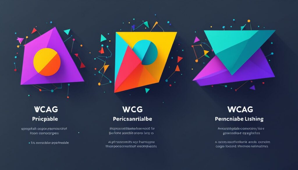
Implementing WCAG guidelines is a step towards making your WordPress website fully accessible. By incorporating these standards into your design and development process, you can ensure that your website is usable and inclusive for everyone.
Website Navigation and Structure
Clear and structured navigation is essential for ensuring website accessibility. By implementing proper headings, links, and HTML5 sectioning elements, you can enhance user experience and improve comprehension of your content. Incorporating landmarks and skip links further facilitates easy navigation, allowing users to quickly jump to specific sections of your webpage. These elements contribute to the overall accessibility and usability of your website, ensuring a positive experience for all visitors.
When it comes to website navigation and structure, keep the following best practices in mind:
- Use Descriptive Headings: Effective use of heading tags (h1, h2, h3, etc.) provides a clear hierarchy of information. Structuring your content with headings makes it easier for users, including those with assistive technologies, to understand the organization of your webpage.
- Ensure Intuitive Links: Use meaningful and descriptive anchor text for your links. Avoid generic phrases like “click here” and provide context to improve user understanding. Additionally, make sure your links are distinguishable through proper styling or color contrast.
- Implement HTML5 Sectioning Elements: HTML5 introduces sectioning elements such as
<article>,<nav>, and<aside>, which enhance both document structure and accessibility. Properly utilizing these elements helps organize and delineate content within your page. - Utilize Landmarks: Landmarks define regions of your webpage and assist users in understanding its structure. Use landmark elements like
<header>,<main>, and<footer>to clearly identify and separate different sections of your website. - Include Skip Links: Skip links provide users with the ability to bypass repetitive or navigational content and jump directly to the main content of a webpage. This feature is particularly helpful for keyboard-only users and those using screen readers.
By combining these strategies and adhering to accessibility guidelines, you can create a well-structured and navigable website that caters to a diverse audience, ensuring a seamless and inclusive browsing experience for all.
Consider the following example:
| Website | Accessibility Features |
|---|---|
| YourWebsite.com |
|
|
|
Ensure your website navigation and structure promote accessibility, allowing users to easily navigate your content and access the information they need. By implementing these strategies, you can create a website that is inclusive, user-friendly, and upholds the principles of WordPress Accessibility.
Images and Media Accessibility
When it comes to website accessibility, ensuring that images and media are accessible to all users is essential. By implementing certain practices, you can make your WordPress website more inclusive and user-friendly.
Alt text is a crucial element in image accessibility. Alt text provides a textual description of the image for users who cannot see it. It is important to create descriptive alt text that effectively conveys the information or context of the image. By including relevant keywords in your alt text, you can also improve the SEO of your website. For example, instead of using alt text like “image1234.jpg,” you can use alt text like “WordPress Accessibility – Alt Text Best Practices.”
However, it’s important to note that decorative images do not require descriptive alt text. Decorative images are those that don’t provide any relevant information and are purely for aesthetic purposes. In such cases, you can use empty alt text (alt=””) to indicate that the image is decorative and does not convey any meaningful content.
Another aspect of media accessibility is providing captions and transcripts for audio and video content. Captions are text overlays that display synchronized dialogue or descriptions of audio elements. They are crucial for users who are deaf or hard of hearing. Transcripts, on the other hand, are textual versions of the content that can be read by users who cannot access the audio or video. By providing captions and transcripts, you ensure that your audio and video content is accessible to a wider audience.
Audio description is an additional accessibility feature that enhances the understanding of video content for blind or visually impaired users. Audio description provides a separate audio track that describes the visual elements, actions, and scene changes in the video. By including audio descriptions, you ensure that all users can fully comprehend and enjoy your video content.
Accessibility is crucial for ensuring that your website is usable and inclusive for all users, regardless of their abilities. By implementing descriptive alt text for images, providing captions and transcripts for audio and video content, and including audio descriptions, you make your website more accessible and improve the overall user experience.
Color Contrast and Typography
When it comes to website accessibility, paying attention to color contrast and typography is crucial. These factors directly impact the readability and user experience of your website. By ensuring proper color contrast and thoughtful font choices, you can create a website that is accessible and user-friendly for all visitors.
Color Contrast
Proper color contrast is essential for individuals with visual impairments or color vision deficiencies. It ensures that the text and background have enough differentiation to be easily readable. To meet accessibility standards, strive for a contrast ratio of at least 4.5:1 for normal-sized text (14pt or 18.5px) and 3:1 for large text (18pt or 24px). This ensures that people with visual impairments can easily perceive and comprehend your content.
Here is an example of a color contrast table:
| Text Color | Background Color | Contrast Ratio | Pass/Fail |
|---|---|---|---|
| #000000 (Black) | #FFFFFF (White) | 21:1 | Pass |
| #FF0000 (Red) | #00FF00 (Green) | 1.4:1 | Fail |
| #333333 (Dark Gray) | #666666 (Medium Gray) | 4.2:1 | Pass |
Image:
Typography
The choice of font styles and sizes significantly affects the readability and accessibility of your content. Here are some tips to consider:
- Font Styles: Select fonts that are clear, legible, and easy to read. Avoid decorative or overly stylized fonts that may be challenging for some users to interpret.
- Font Sizes: Opt for a font size that is large enough for users with visual impairments to read comfortably. Use relative units like percentages or ems to ensure that the text scales appropriately across different devices and screen sizes.
Key Takeaways
By prioritizing color contrast and typography, you create an inclusive and accessible website. Ensure that your content is readable and easily comprehensible for all users. Let’s recap the key points:
- Strive for a proper color contrast ratio to make the text stand out from the background.
- Choose fonts that are clear, legible, and easy to read.
- Optimize font sizes to accommodate users with visual impairments.
Remember, accessibility is about creating an inclusive user experience and reaching a broader audience. By implementing these practices, your WordPress website can become accessible and welcoming to all visitors.
Keyboard Navigation and Assistive Technologies
When it comes to website accessibility, keyboard navigation plays a crucial role. Not all users can rely on a mouse or other pointing devices to navigate the web. That’s why it’s essential to ensure that your WordPress website can be easily navigated using only the keyboard.
Assistive technologies, such as screen readers, are commonly used by individuals with visual impairments. These technologies depend on proper HTML markup and adherence to W3C Web Standards to interpret and present web content effectively to users. By designing your website with keyboard navigation and assistive technologies in mind, you can significantly improve its accessibility and make it inclusive for all users.
By providing keyboard navigation support, you empower users who rely on assistive technologies to navigate your website efficiently. It allows them to interact with all interactive elements, access content, and perform actions without the need for a mouse.
Integrating keyboard navigation into your WordPress site involves implementing proper HTML markup, using accessible plugins and themes, and ensuring that all functionality and features are accessible through keyboard interactions. This includes features like dropdown menus, forms, sliders, and more. Testing your website’s keyboard navigation using real devices and assistive technologies is crucial to identify and address any accessibility issues.
Adhering to W3C Web Standards is also essential for ensuring compatibility with assistive technologies. Following these standards helps guarantee that your website is accessible to users of different assistive devices and screen readers, providing them with a seamless browsing experience.
Additionally, consider adding skip links to your website. Skip links allow users to bypass repetitive content and navigate directly to the main content of a page. This feature is especially valuable for screen reader users as it saves them time and provides a more efficient browsing experience.
| Benefits of Keyboard Navigation and Assistive Technologies |
|---|
| Improved accessibility for users who cannot use a mouse |
| Enhanced compatibility with screen readers and assistive technologies |
| Increased usability and inclusivity for all visitors |
| Compliance with accessibility guidelines and standards |
By prioritizing keyboard navigation and assistive technologies in your website design, you create an inclusive online environment that benefits all users, regardless of their abilities. It’s not only a matter of accessibility but also of providing a smooth and enjoyable user experience for everyone.
Conclusion
Ensuring accessibility in WordPress is crucial for creating an inclusive and user-friendly website. By following accessibility guidelines, using accessible themes and plugins, and considering all users’ needs, you can create a website that welcomes and accommodates all visitors. Accessibility should be a continuous effort, with constant improvement to provide an optimal user experience for everyone.
Website accessibility is not just about meeting legal requirements; it is about making your website accessible to as many people as possible. By implementing inclusive design principles and considering the diverse needs of your audience, you can create a website that is accessible to individuals with disabilities, as well as those who use different devices or assistive technologies.
With WordPress, you have the tools and resources to make your website accessible. Follow accessibility guidelines such as the Web Content Accessibility Guidelines (WCAG), choose accessible themes and plugins, and test your website for compliance. Remember that accessibility is not a one-time task, but an ongoing process. Continuously strive to improve your website’s accessibility to provide a better user experience for all.
BoostedHost offers WordPress Hosting that can optimize the performance of your accessible website. Sign up now through this link: www.boostedhost.com/wordpress-hosting and experience the benefits of an accessible website with excellent speed and reliability.
FAQ
Q: What does website accessibility mean?
A: Website accessibility refers to making websites usable by as many people as possible, including those with disabilities and users with different devices and search engines. It ensures that all users can access and use a website, regardless of their abilities or limitations.
Q: Why is web accessibility important?
A: Web accessibility is important because it allows a wider audience to access and use a website. When a site is inaccessible, a portion of the audience is unable to fully access the information it offers. Lack of accessibility can also result in legal consequences, as individuals can take legal action against inaccessible websites.
Q: How accessible is WordPress?
A: WordPress has made strides in improving accessibility with each release. The community is passionate about accessibility and constantly works towards making WordPress more accessible. Default WordPress themes have taken steps towards accessibility, and developers are creating assistive tools and resources. However, WordPress still has room for improvement, and considerations such as theme selection and use of plugins can affect accessibility.
Q: What are the best practices for accessible design in WordPress?
A: Best practices for accessible design in WordPress include using descriptive alt text for images, using CSS for decorative images, providing clear labels for form inputs, using semantic HTML elements like headings and lists, and ensuring proper color contrast. These practices contribute to a more accessible user experience and improve usability for all visitors.
Q: What are the Web Content Accessibility Guidelines (WCAG)?
A: The Web Content Accessibility Guidelines (WCAG) are standards for web accessibility. They provide guidelines and criteria for making websites usable by all individuals. Designers, developers, and other stakeholders should be familiar with these guidelines and incorporate them into their website building process for creating fully accessible websites.
Q: How can I ensure proper website navigation and structure for accessibility?
A: Proper use of headings, links, and HTML5 sectioning elements helps users navigate and understand the content. Landmarks and skip links provide shortcuts for users to jump to specific sections of a webpage. These elements improve accessibility and make it easier for users to navigate and comprehend the website.
Q: How do I make images and media accessible on my WordPress website?
A: Images should have descriptive alt text to provide information to users who cannot see them. Decorative images can use empty alt text. Captions and transcripts should be provided for audio and video content to make them accessible to users who are deaf or hard of hearing. Audio descriptions can enhance the understanding of video content for blind or visually impaired users.
Q: What should I consider for color contrast and typography in terms of accessibility?
A: Ensuring proper color contrast and typography is crucial for website accessibility. The contrast between text and background should meet accessibility standards to ensure readability. Font styles and sizes should be chosen carefully to enhance readability and legibility. Attention should be paid to the overall visual design to create a website that is accessible and user-friendly for all visitors.
Q: How can I ensure keyboard navigation and compatibility with assistive technologies?
A: Keyboard navigation is essential for users who cannot use a mouse or other pointing devices. Websites should be navigable using only the keyboard. Assistive technologies like screen readers rely on proper HTML markup and adherence to W3C Web Standards to interpret and present web content to users. Designing with keyboard navigation and assistive technologies in mind improves website accessibility.
Q: What is the importance of website accessibility in WordPress?
A: Ensuring accessibility in WordPress is crucial for creating an inclusive and user-friendly website. By following accessibility guidelines, using accessible themes and plugins, and considering all users’ needs, you can create a website that welcomes and accommodates all visitors. Accessibility should be a continuous effort, with constant improvement to provide an optimal user experience for everyone.

